A fast-paced, competitive motorbike arena battler where stray cats fight to the ninth life.
Project Details
Role: UI/UX Designer & Systems Designer
Platform, Engine: PC, Unreal Engine 5.6
Date: August - December 2025
Team Size: 8
Project Summary
Purrsuit is a no-holds-barred multiplayer arena game set in “The Litterbox,” a chaotic stadium where stray cats battle atop weaponized motorbikes. Players shoot out sections of the arena floor to send opponents falling into “Purr-gatory,” while dodging hazards and outmaneuvering rivals at high speed.
Intent
Our goal was to create a high-energy competitive experience that feels sharp, chaotic, and fast from the first interaction — including the UI.
From a UX perspective, I focused on:
Reinforcing speed and aggression through visual language
Maintaining clarity in a visually chaotic arena
Supporting split-screen multiplayer without overwhelming players
Ensuring feedback clearly communicates win/loss states
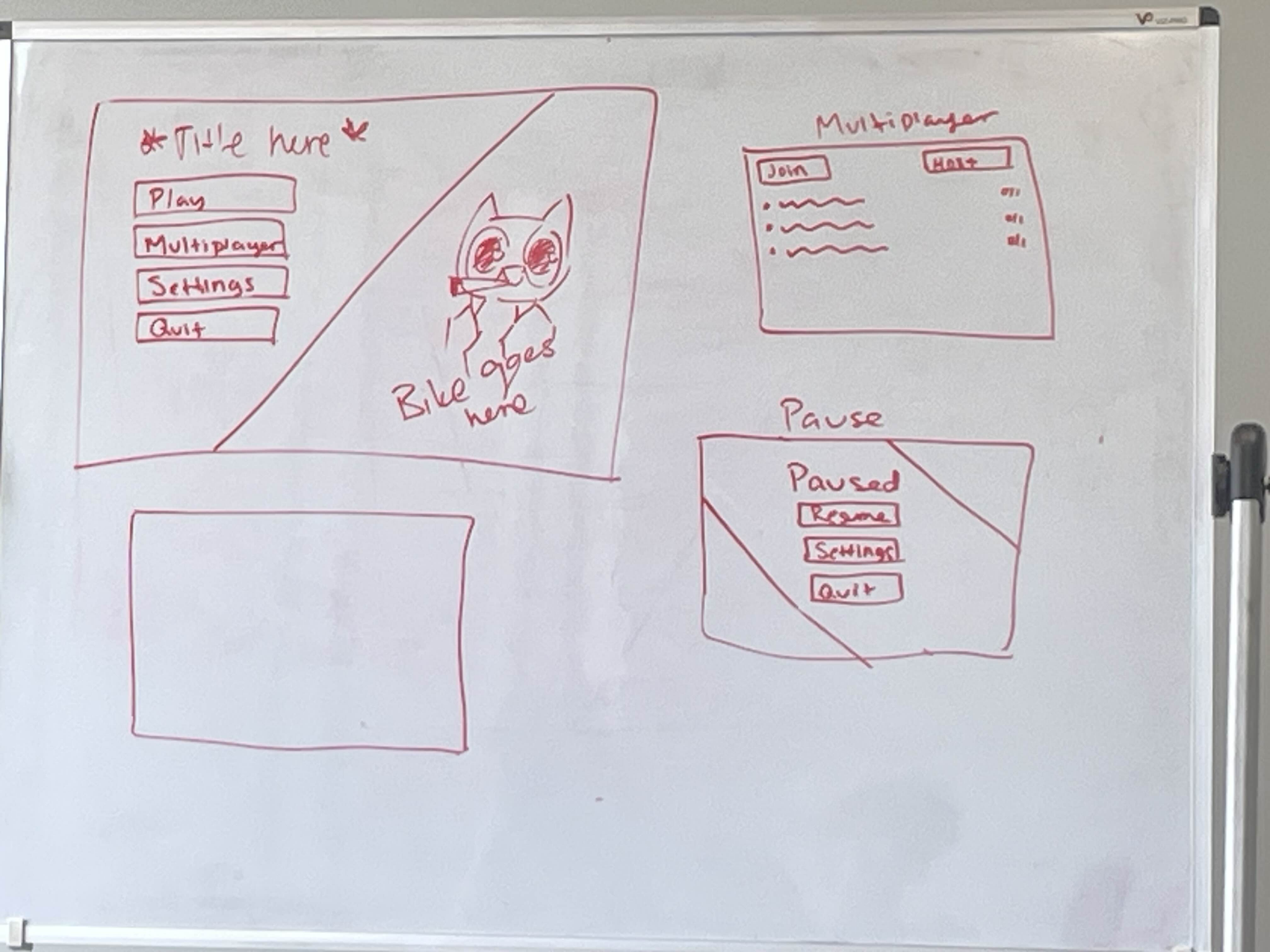
Key UI
-
![]()
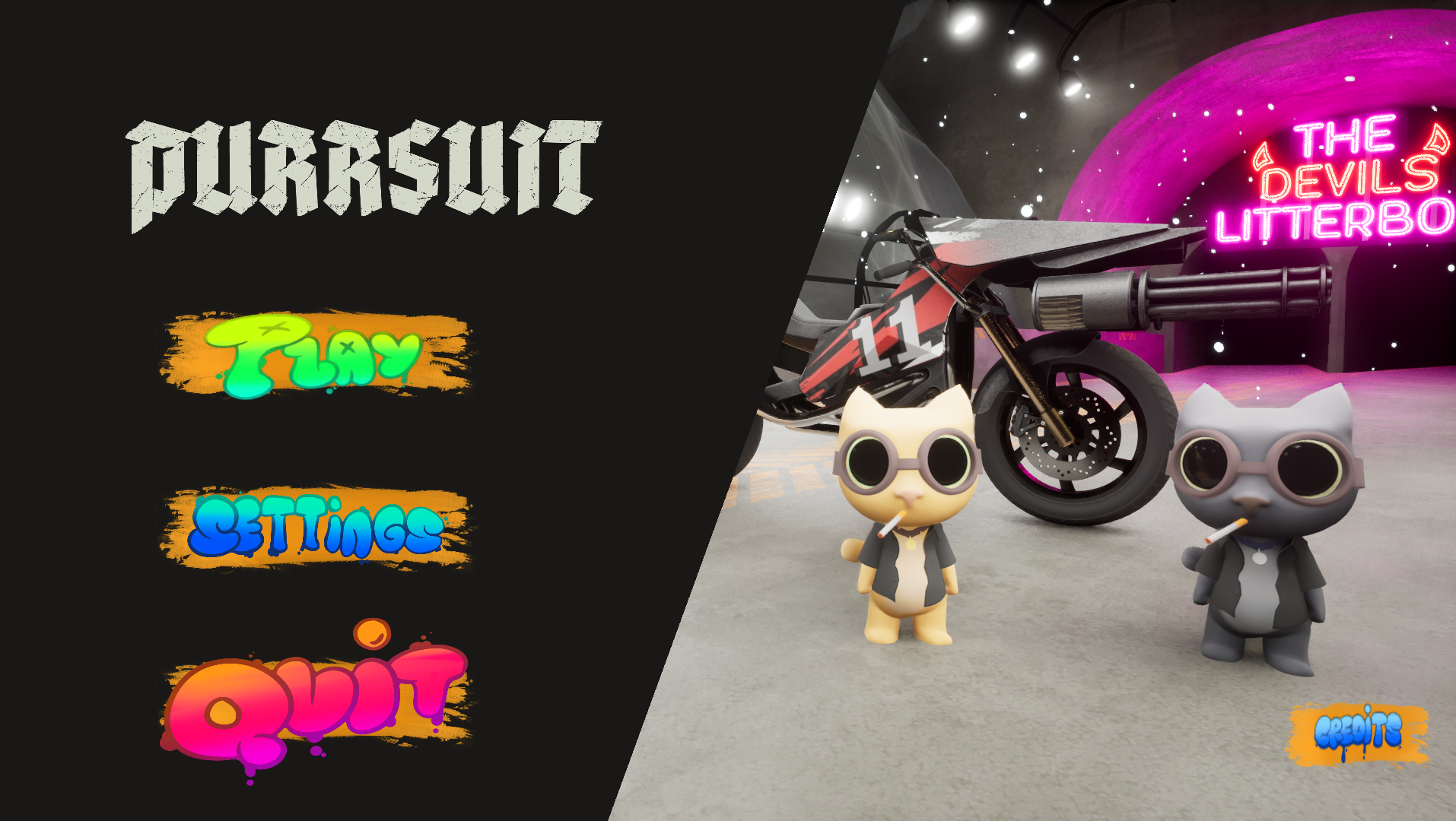
Main Menu
Goal: Showcase personality and movement.
The bike and character are prominently displayed.
Planned character animations add energy and presence.
Buttons are designed to be reactive (hover states, scaling, highlight feedback).
This establishes tone immediately and reinforces the game’s fast-paced identity.
-
![]()
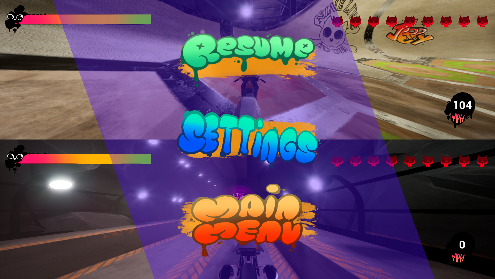
Pause Menu
Goal: Maintain clarity during chaos.
Because gameplay in “The Litterbox” is visually intense, the pause menu was intentionally minimal:
Slanted overlay panel
Semi-visible gameplay background
Reactive button states
One shared pause menu (host-controlled)
This ensures usability without overpowering the active scene.
-
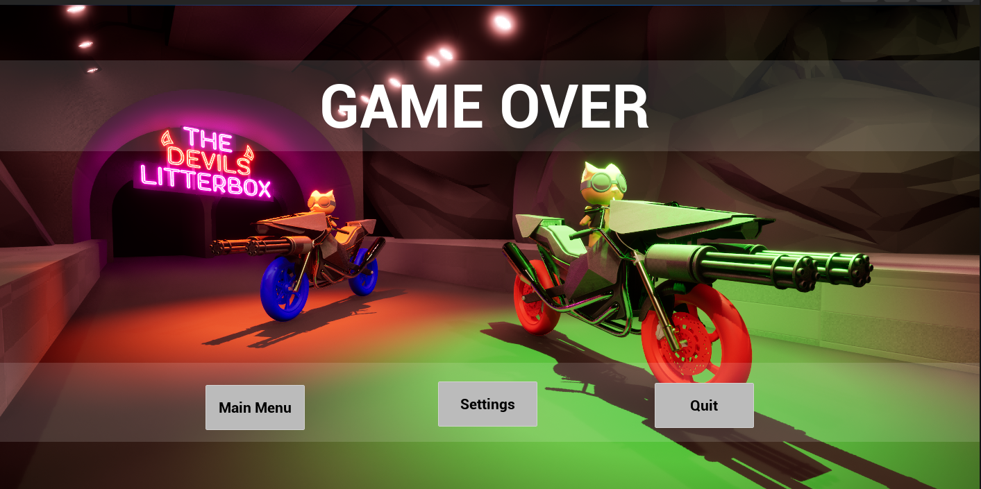
![]()
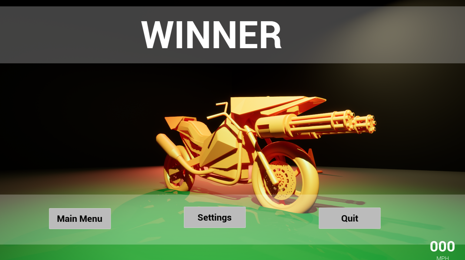
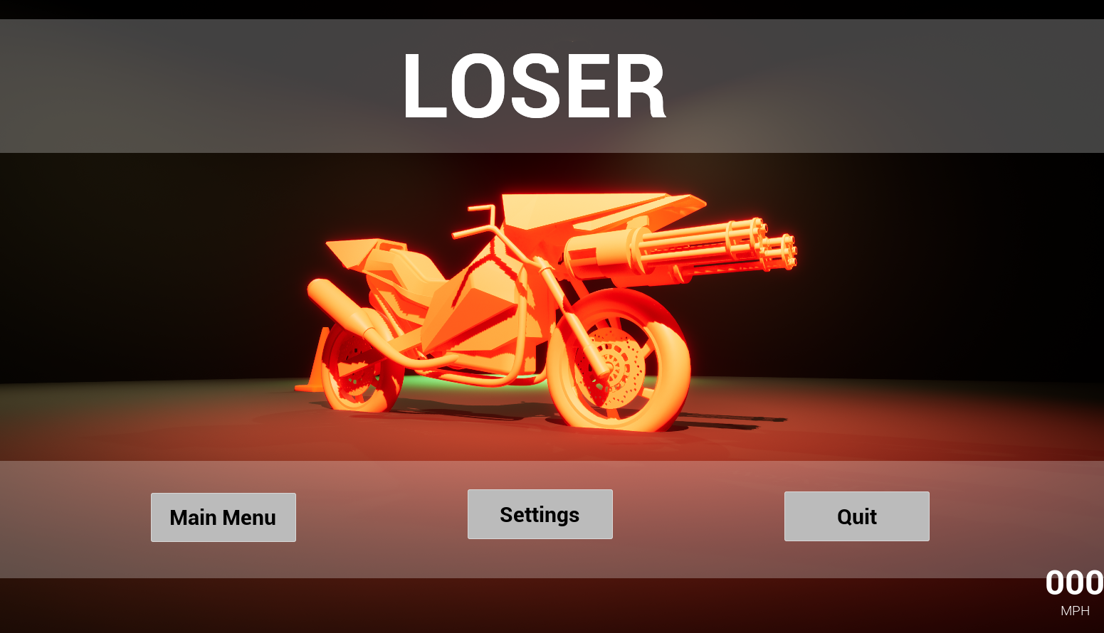
Win/Loss System
Goal: Deliver a strong competitive payoff while preserving a shared space.
Clear visual hierarchy distinguishes Winner vs. Loser
Players are repositioned dynamically depending on results
Character reactions align with their outcome
This approach improved clarity, strengthened the emotional impact of victory and defeat, and avoided the visual fragmentation caused by our original split-screen concept.
-
![]()
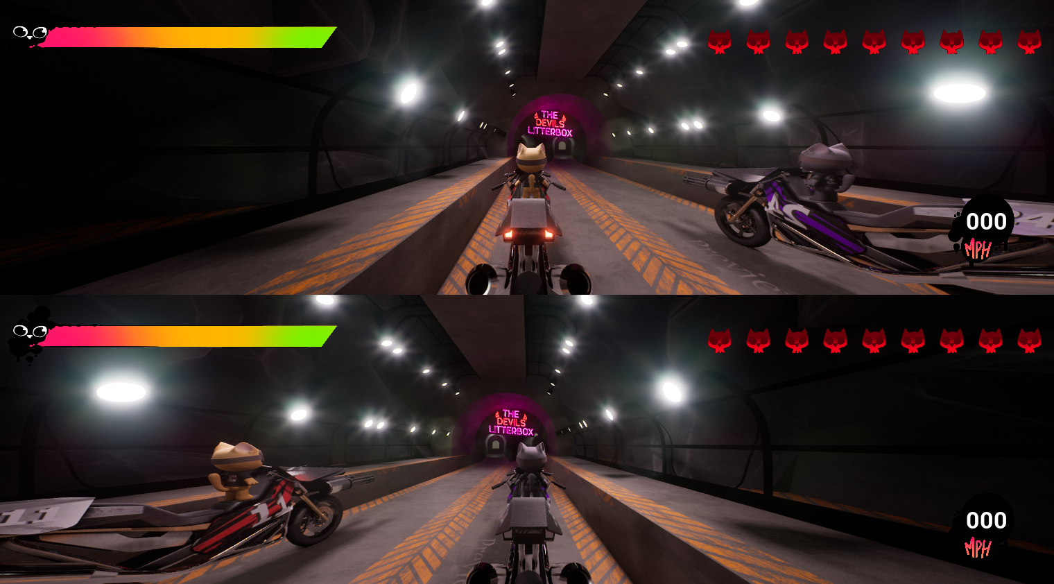
Multiplayer UI Design
Goal: Build scalable, multiplayer-safe UI systems that prioritize clarity, responsiveness, and competitive feedback in a fast-paced environment.
Multiplayer-safe UI logic
Shared vs. player-specific UI states
Clear hierarchy under visual pressure
Readability during motion-heavy gameplay
Reactive feedback loops
I ensured that every interface element had intent and gameplay purpose, not just visual style.

UI/UX Design Process
1. Concept & Sketching
We drew inspiration from modern racing games — leaning into angular cuts, slash-style visuals, and aggressive framing to reinforce speed.
I began with hand-drawn sketches to explore layout hierarchy, readability, and visual tone.
My focus was:
Strong diagonals and sharp shapes
Motion-driven layouts
High contrast for readability in fast gameplay
3. Visual Styling & Theming
Once functionality was solid, I aligned the UI with the game's identity:
Diagonal slanted panels
Angular framing devices
Motion-heavy compositions
Sharp typography treatment
The visual language reinforces the intensity of the arena and mirrors the
destructible environment.
2. Functional First Pass
Before styling, I implemented the UI in Unreal to ensure:
All systems worked correctly
Inputs were responsive
Multiplayer compatibility functioned properly
This phase prioritized usability over aesthetics.
4. Playtesting & Iteration
We conducted team playtests and gathered usability feedback.
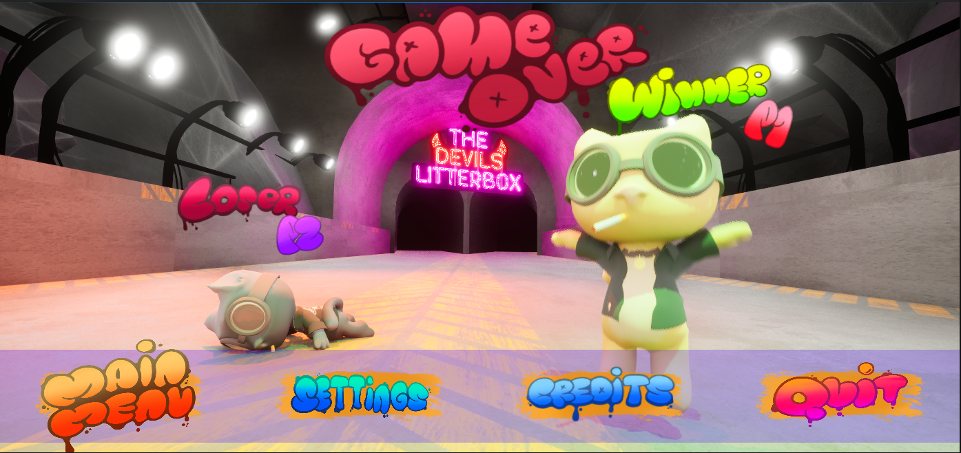
Example Iteration – End Screen Redesign:
Originally, the Win/Loss screen used a split-screen layout.
Testing revealed:
It reduced clarity
It visually cluttered the outcome moment
We redesigned it into a single shared screen:
Clear visual indicators distinguish winner vs. loser
Character reactions reinforce emotional feedback
This improved clarity and strengthened the competitive payoff.